The digital world is extremely crowded today. There are so many products and services being offered in the digital world that your presence can get lost in the noise if you don’t push for that extra mile. Of course, what strikes the eye first in an online world is the design of your logo, website, etc. While design trends are always changing, the best ones stay for a while before they slowly start to fade away. So, what are the design trends that will remain relevant in 2018 and help your brand stand out from the crowd? Here are 8 of the best ones.
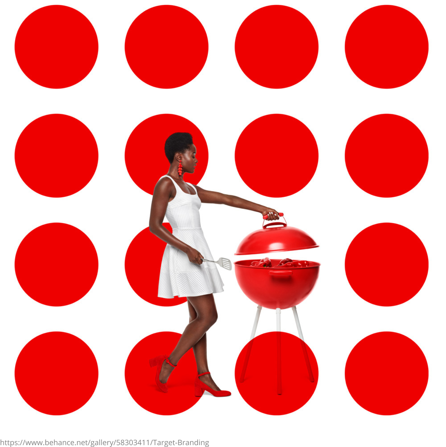
1. Striking Colors
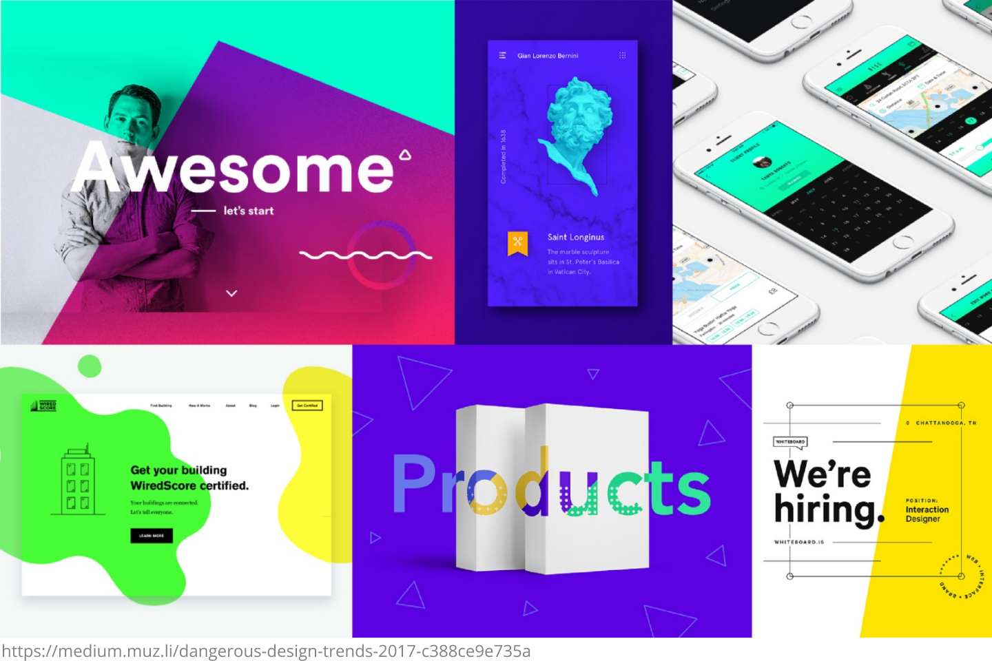
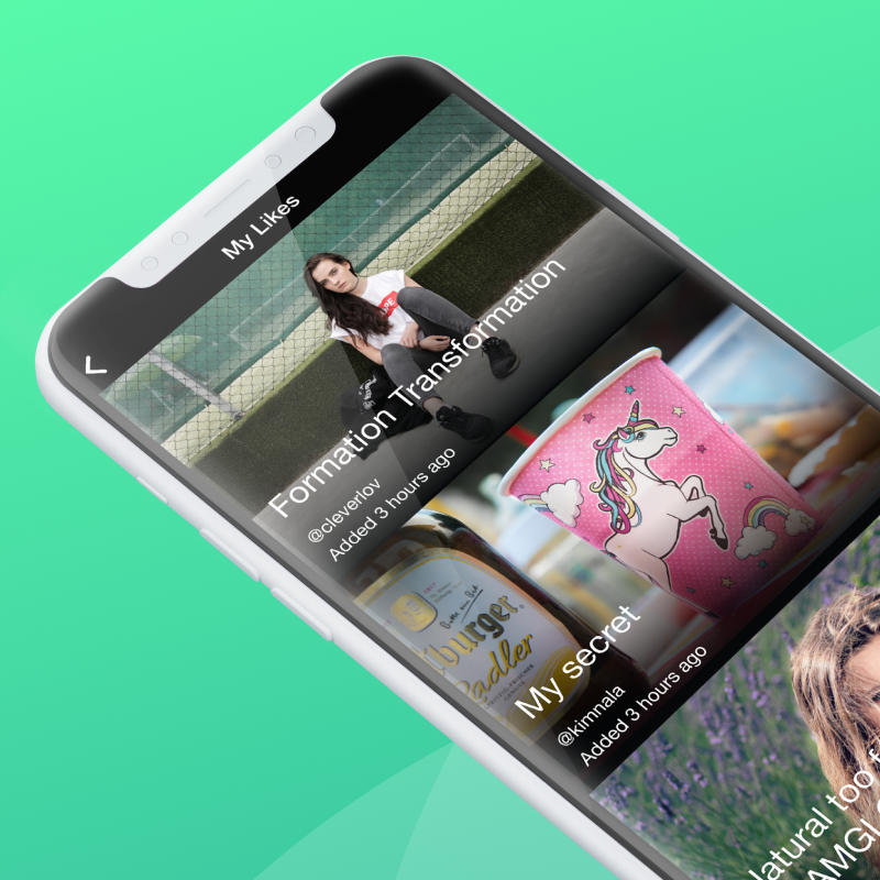
When you design a logo or website, the first thing you imagine is the esthetics. Your design needs to have the quality to get people’s attention at first glance. While gray, black and white colors were common in the past designs, today belongs to striking, bold and bright colors. You can take the example of Spotify. They use the bright colors perfectly in their logos and designs, but what separates them is the use of edited photos that often appear in their designs. Today, you can recognize Spotify with the images it shares across the internet.
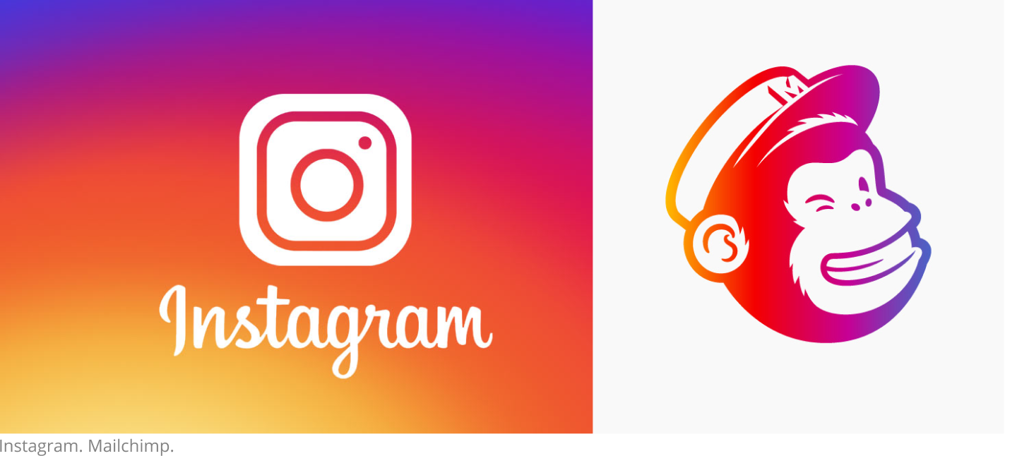
Similarly, Instagram had a very dull logo when it came to the internet world. However, the company realized the changing trends and the need to make a brighter and more striking impact. The new logo has striking colors and catches the eye immediately.
2. Large and Bold Typeface
Large fonts have been creeping into the designs with the passage of time and 2018 will see a lot of bold and large typefaces. The American magazine, namely Wired is a great example of how to use bold and large fonts. The good thing about Wired is that they don’t use just one but a lot of different typefaces that grab your attention within a second.
HubSpot is another great example and a company to follow when it comes to successful social media marketing. Their images with bold and clear fonts on them are very visible as you go through your stream on social media. You can take a look at their Twitter page to get a better understanding of how they make their social media content attractive.
These bold fonts make sense today because mobile usage is increasing and large fonts are more convenient for mobile users to read.
3. Google Fonts
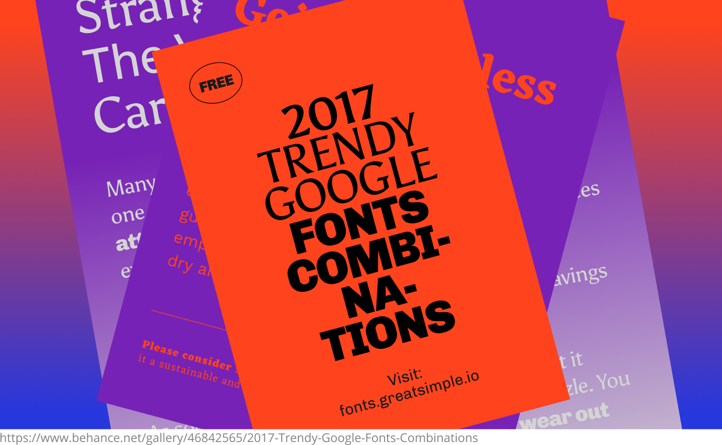
If you are not already using Google fonts, you should start using them now. One of the biggest reasons why you should be using Google fonts is that they are available for free. Some other fonts can cost you as much as $25 for a single font face. In addition to that, you will also have to face pageview limits when you buy those fonts. Google fast content delivery network also take care of the common cross-platform rendering problems that often haunt website designers. Once you have designed something using Google fonts, you will not face any rendering issues on platforms no matter which major browser your design is opened on. Last but not least, these are open source typefaces that don’t require any licensing.
4. Authentic pictures
 One thing you want to avoid in 2018 is stock images. Millions of pictures are uploaded on the internet every day across dozens of social networking websites and millions of other websites. People who search for images get to see the same images over and over. They can spot a stock image within seconds, and while they won't hate you for using a stock image, they will not be attracted at all toward your design. Creating original pictures can be costly, but user satisfaction is the return for this effort.
5. Hand Drawn Graphics and Icons
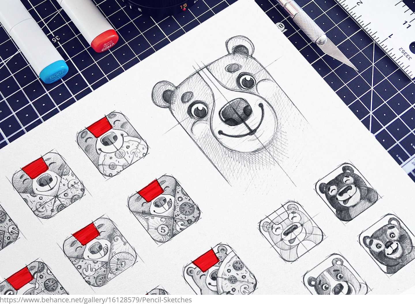
Hand drawn images can be unique images because every designer's brain is different and if you give 100 designers the same thing to draw with their hands, they will all come up with unique versions of the same image.
You might have heard about whiteboard animations created with hands. These images and videos are becoming a trend today, and studies show that they are much more successful in keeping their viewers engaged than any other type of visuals. So, do not overlook the importance of hand-drawn images and use them in your designs whenever you can.
6. Minimalistic Approach
A minimalistic approach is a trendy approach these days whether you are designing a brand logo or a website. There are, however, quite a few misconceptions about minimalism in design. People believe that a minimalistic design will use dull colors, and a lot of space will be left empty, but that's not the accurate interpretation of the term. Take a look at this Medium logo. It does use multiple colors, but the minimalism is strong in the logo. The colors have not been overdone, and even the name of the brand contains no funny characters and embellishments.
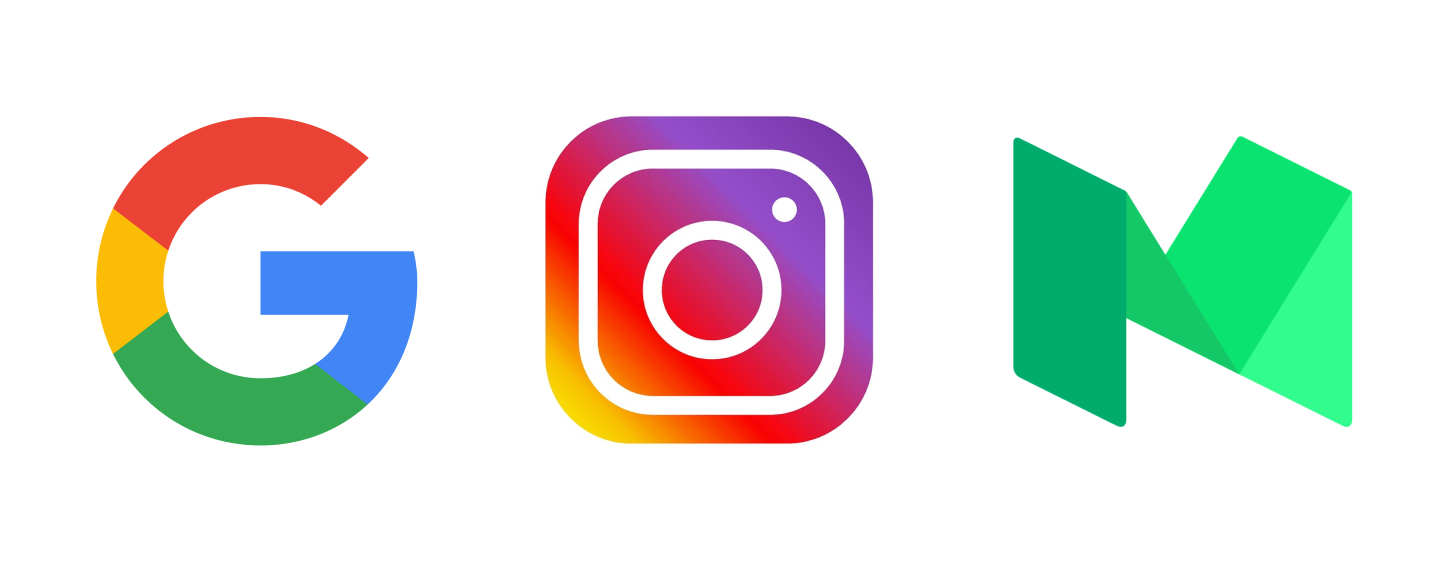 The search engine giant Google has also proved how minimalism works in logo designs. The good thing about Google logo is it does not feel minimalistic but is a prime example of minimalism in logo designs.
7. Interesting Gifs
https://www.behance.net/gallery/52948631/Yeaaah-Studio-Spring-2017
Sometimes, a still picture is not enough to deliver the message as strongly as a moving picture can. Whether it’s a blog or a website, putting a video on it is not that easy due to issues related to page loading speeds. That's when gifs are the best choice because they are moving and attention-grabbing. A small 3 to 5-second video loop used as a gif can send a simple message strongly. While they provide great entertainment, their size is still pretty small, so their presence on a website does not affect the website speed that much. The Next Web is a great example of websites that use interesting gif images on their homepages.
8. Inevitable Duotones
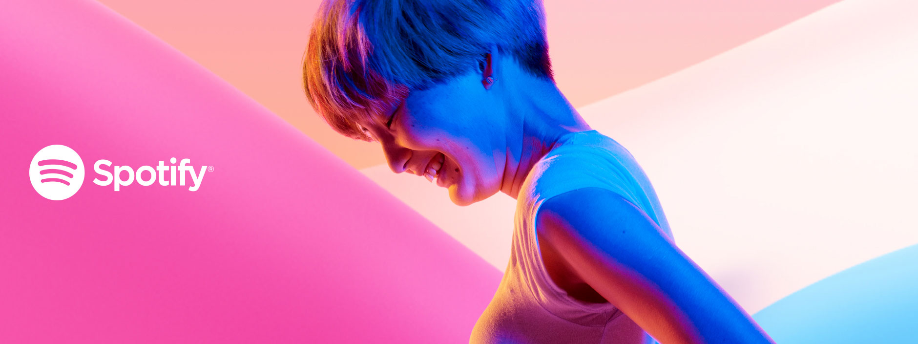
The world of design was not the same before Spotify jumped into the digital world and dazzled the brands with its duotone design. Duotone designs, as the name suggests, are created using two colors. These colors, on most occasions, are very bright and bold, and that’s why they create a very strong visual effect. Check Spotify’s website to see how to use duotones in design and make every aspect of the design stand out with duotone backgrounds.
Conclusion
Whether you are designing your website, brand logo or an email to be sent to your customers, you can have the best marketing impact on your target audience through unique design elements. It is, therefore, highly recommended that you stay updated with the latest trends in design. We believe the information given above is going to help you greatly with your upcoming designs and somewhat assist you in making your brand identity stick out despite the crowded and competitive online world.